Selecting the Best Aspect Ratio for Portraits, Landscapes, and Products
Learn how to choose and crop the right aspect ratio for portraits, landscape views, and ecommerce products without sacrificing composition or layout consistency.
Understanding Aspect Ratio and How It Differs From Resolution
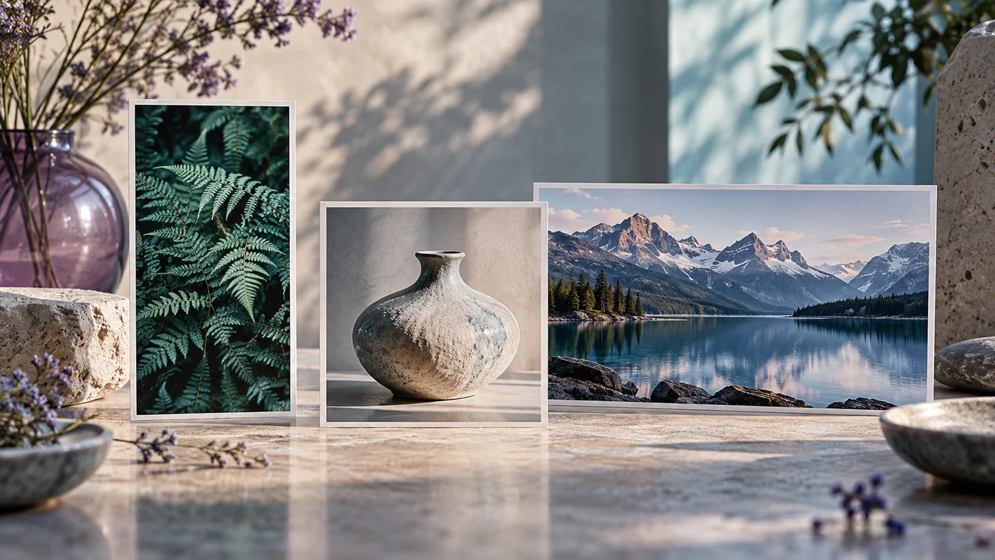
An aspect ratio defines the proportional relationship between the width and the height of an image. It is expressed as two numbers separated by a colon, such as 1:1 for a square or 16:9 for widescreen framing. Aspect ratio determines the shape of your canvas, not its physical resolution or visual fidelity.
It is important to separate aspect ratio from pixel dimensions and file size. An image measuring 1200 by 1200 pixels and another measuring 4000 by 4000 pixels share an identical 1:1 aspect ratio, but the larger image contains roughly eleven times more pixels and requires more storage space. Modifying an aspect ratio changes what stays inside or outside the frame. In contrast, resizing alters pixel dimensions, and compression reduces file size. Understanding this distinction prevents accidental distortion, such as squishing a rectangular subject to fit a square frame.
Portrait Photography: Balancing Focus and Negative Space
Portraits usually demand vertical framing to match the upright human posture. The standard 2:3 vertical ratio produced by most digital cameras is traditional, but it can leave excessive, distracting empty space above the head or below the torso in tightly framed portraits.
A 4:5 or 3:4 vertical ratio is generally more flattering for headshots and three-quarter portraits. These slightly wider vertical proportions bring visual attention straight to the eyes, shoulders, and expressions without requiring awkward background padding. For full-body fashion shots, however, 2:3 remains effective because it accommodates the full height of a standing model naturally. Vertical 9:16 is popular for mobile social video and story formats, but it is often too narrow for still portraits, frequently clipping hair, elbows, or garments when framed close.
Landscape Photography: Capturing Scale and Context
Landscape photography relies on horizontal framing to convey expansiveness, context, and horizontal movement. The traditional 3:2 horizontal ratio provides a balanced distribution between sky and ground, making it an excellent default for natural vistas that feature foreground elements like rocks or foliage.
When your goal is a cinematic panoramic feeling, 16:9 or 2:1 crops work well. These wider formats emphasize sweeping horizon lines, ocean coastlines, and mountain ranges by eliminating unnecessary sky or foreground clutter. However, wide ratios struggle with tall natural features. If a composition includes towering waterfalls, steep cliffs, or tall trees, forcing a 16:9 crop cuts away the sense of scale. In those situations, keeping the native 3:2 ratio or switching to a vertical 4:5 orientation captures height far more effectively.
Product Photography: Uniformity and Catalog Layouts
Product photography requires structural consistency above all else. For online stores and catalog listings, the 1:1 square ratio is the industry standard. A square canvas creates uniform grids across different device screens, ensuring that round, tall, and wide items sit neatly side by side without causing broken gallery layouts.
For specialized ecommerce categories like apparel, footwear, or upright bottles, a vertical 4:5 ratio is a viable alternative. It fills vertical mobile screens more completely, giving shoppers a closer view of textures and materials. Whichever ratio you select for your store, maintain that exact ratio across the entire category. Mixing 1:1, 16:9, and 2:3 images within the same product catalog produces irregular grid heights, misaligns pricing labels, and distracts customers.
Practical Cropping Workflow: An Ecommerce Example
To see how this works in practice, imagine you have photographed a ceramic mug on a wooden tabletop using a standard camera. Your raw input image has a native 3:2 aspect ratio with illustrative dimensions of 6000 by 4000 pixels. The destination is an online store category page requiring a 1:1 square ratio.
Open the image in your cropping tool and lock the aspect ratio setting to 1:1. Position the cropping frame over the mug, making sure the product remains centered with roughly 10 to 15 percent margin space around all sides. This breathing room prevents the mug handles or rim from colliding with the edges of the display tile. Apply the crop to yield a square master at 4000 by 4000 pixels, then export a web-ready version scaled down to your platform's required display size, such as 1200 by 1200 pixels.
Check the result by viewing the exported file at small thumbnail sizes on both desktop and mobile layouts. Verify that the product is clearly distinguishable, margins remain even, and no fine details were lost through improper interpolation during resampling.
Common Aspect Ratio Mistakes and Next Steps
A frequent mistake is cropping too close to your subject before determining the final presentation format. Once pixels are cropped away, they cannot be reconstructed. Always capture photos with slightly wider margins than necessary, allowing flexibility to adjust between square, vertical, or widescreen crops later.
Another error is stretching an image to fit a container instead of cropping it, which warps facial features and distorts product proportions. As a next step, document the target aspect ratios for each of your distribution channels—such as 1:1 for product galleries, 4:5 for portraits, and 16:9 for blog hero banners—and set up cropping presets in your editor to streamline future image preparation.
Try an idea and review your result before saving your edits.