Converting HTML Designs into Clean Static Images: A Pre-Export Checklist
Learn how to turn code-based HTML and CSS layouts into crisp static graphics while avoiding common pitfalls like missing fonts, incorrect dimensions, and clipped text.
Why Render HTML and CSS to Static Graphics?
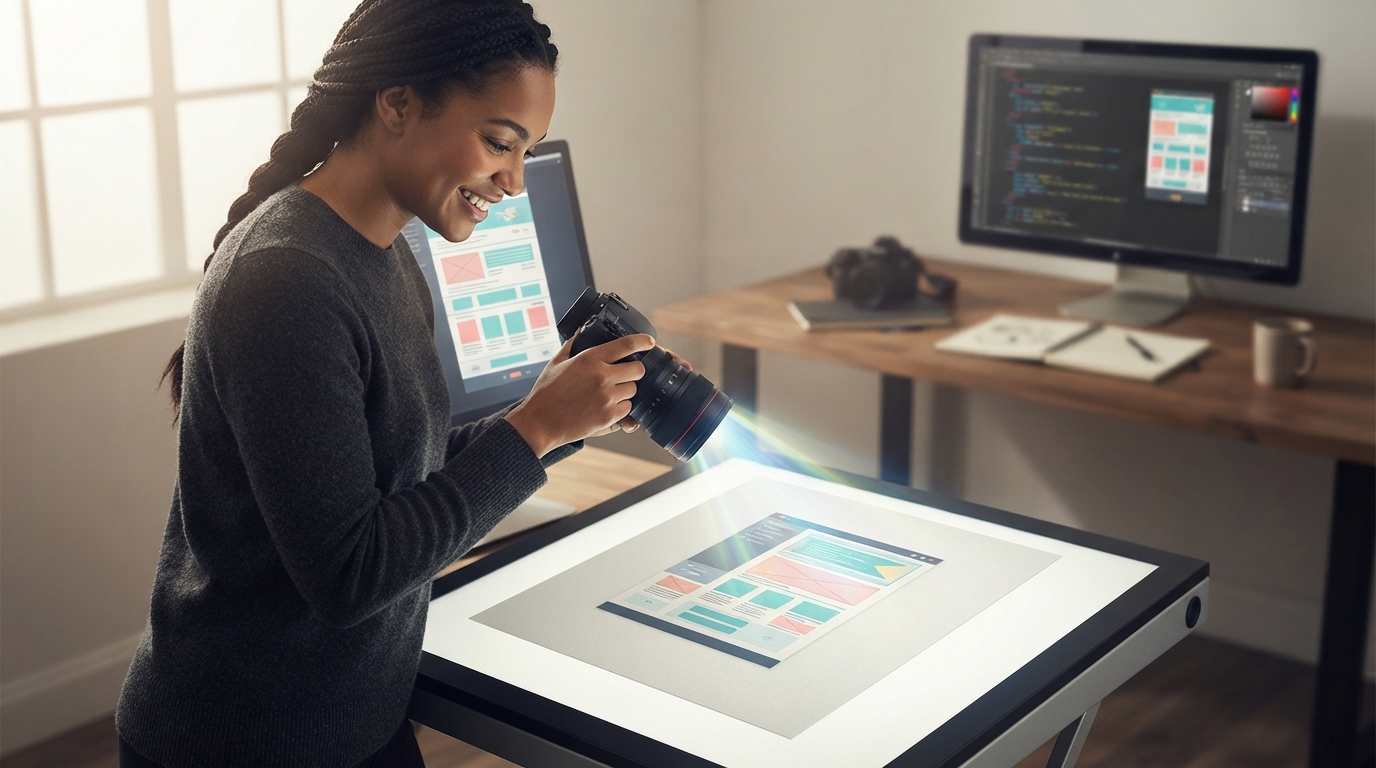
Designing graphics with HTML and CSS allows creators and developers to build layouts with clean typography, dynamic data, and flexible flexbox or grid arrangements. Many workflows use this technique to generate social sharing cards, promotional banners, product certificates, and automated marketing graphics. Instead of manually editing hundreds of individual canvases in graphic software, you can programmatically capture a styled webpage element as a PNG, JPEG, or WebP image.
However, converting a web layout into a flat raster graphic introduces distinct rendering challenges. A browser engine interprets style rules differently depending on viewport width, screen density, and resource loading times. If you take a digital snapshot before the styling settles, the resulting image may suffer from replaced system fonts, clipped edges, or blurry resolution.
Aligning Viewport Dimensions with Output Pixel Count
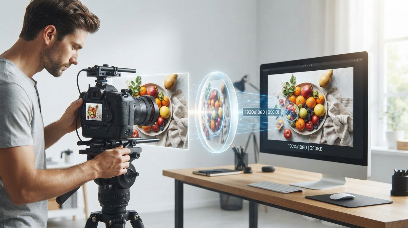
The first step in any HTML-to-image workflow is clearly separating CSS layout units from target image pixel dimensions. CSS pixels represent layout measurements rather than physical screen pixels. If you capture a 600-by-315 CSS layout at standard display density, you produce an image file measuring exactly 600 by 315 physical pixels. When displayed on high-resolution screens or enlarged, this graphic will look noticeably soft.
To produce crisp images, capture your design at a higher device pixel ratio, often referred to as DPR. Rendering a layout at a DPR of 2 doubles the horizontal and vertical pixel density. For example, a 600-by-315 CSS box rendered at a DPR of 2 yields an export file measuring 1200 by 630 pixels. Always set your capture environment to match your required final pixel dimensions to avoid running a secondary resizing step that can degrade sharp edges.
Eliminating Font Flash and Fallback Substitutions
One of the most frequent defects in automated captures is font substitution. When an image capture script triggers before a custom web font finishes downloading, the browser substitutes a default system font such as Times New Roman or Arial. This shifts character widths, disrupts baseline alignment, and changes line breaks.
To ensure your chosen typography appears in the final image, wait for the browser font loading API to resolve before triggering the capture. In production code, you can use document.fonts.ready to confirm all font faces have fully loaded into memory. Alternatively, for standalone single-card generators, you can convert your font file to a Base64 string and embed it directly inside the CSS stylesheet. This embeds the font directly into the document, removing external network latency entirely.
Fixing Edge Clipping and Shadow Truncation
Web browsers handle overflow flexibly, but image export tools strictly crop to the target container's bounding box. Text with tall line heights, descenders like lowercase g and y, and decorative elements often get sliced off if margins and padding are poorly configured.
Ensure your container uses standard box-sizing set to border-box so that internal padding does not push nested content outside the designated dimensions. Always add at least 16 to 24 pixels of internal breathing room around text blocks to protect ascending and descending letters. Furthermore, remember that CSS box-shadow and outline properties render outside the element box. If your element sits flush against the capture edge, outer drop shadows will be sliced off flat. Add a subtle margin around styled cards so outer shadows remain intact.
Step-by-Step Example: Producing a Social Preview Card
Consider an illustrative task: generating a 1200-by-630 pixel promotional preview card using an HTML template.
Input Setup: Define a container with an exact CSS width of 1200 pixels and height of 630 pixels, with overflow set to hidden to prevent scrollbars from appearing in the capture. Set the device pixel ratio to 1 for direct one-to-one mapping, or define a 600-by-315 layout at a DPR of 2.
Action: Place the headline in a container with a fixed line-height value, such as 1.25, and supply 40 pixels of internal padding on all sides. Preload your brand font using a font-face declaration. Program your capture tool to delay the snapshot until all assets, including background images and custom typefaces, report complete loading.
Checks: Inspect the captured graphic at 100 percent zoom. Verify that the headline font matches your brand specification rather than a generic serif or sans-serif fallback. Confirm that punctuation, quotation marks, and descenders on the bottom line show clean space without touching the border.
Final Verification Checklist Before Deployment
Before integrating your HTML layout into a batch image export process, run a manual quality audit on test files. Check file size against your destination platform's requirements. High-resolution PNGs with complex photographic backgrounds can become unnecessarily large; in those cases, a high-quality JPEG or WebP offers cleaner efficiency.
Finally, check color accuracy. Some automated browser environments disable hardware acceleration, which can occasionally alter subtle color gradients or alpha transparency. Once your font loading, box padding, and pixel density settings pass review, you can reliably run bulk image generation with consistent, professional results.
Try an idea and review your result before saving your edits.